
TASK
The vastness of consumer choice brings about product competition that, in turn, fosters the need for market distinction and differentiation.There are dozens of tea producers in shops. Naturally, in order to stand out from the competition, you need a high-quality and memorable packaging design.
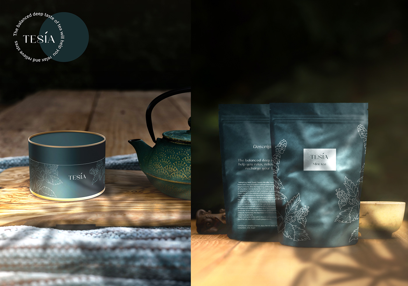
PACKAGING DESIGN
The color of the package always clearly conveys the emotion and association of when to drink a certain tea, or what effect you expect from it. Muted colors are associated with calmness, safeness and stability. Thanks to a small grafic element on the brand name, a consumer can instantly understand what the product is selling.
—————————————
Green color has a tonic tea, blue - soothing, red will set you in a romantic mood.
CATALOG
The catalog has wide range of japanese tea and not only.
«Tesia» tea contains:
1. Pure and natural taste.
2. Bright aroma that persists throughout the entire tea drinking.
3. Versatility of taste.
4. Pronounced aftertaste that lasts for a long time.
—————————————
Advantages of the company: high quality, wide range and naturalness.

Contact me for cooperation:
E-mail: tatianagrad.design@gmail.com


